The first (with the key) 
1 Like
I have only one question to you: What program did you use, and where can I download it?! 
1 Like
Professional secret😎
1 Like
I also like the first one with the key most until now. 
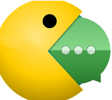
Still I fear that people will mistake the envelope for pacman… 

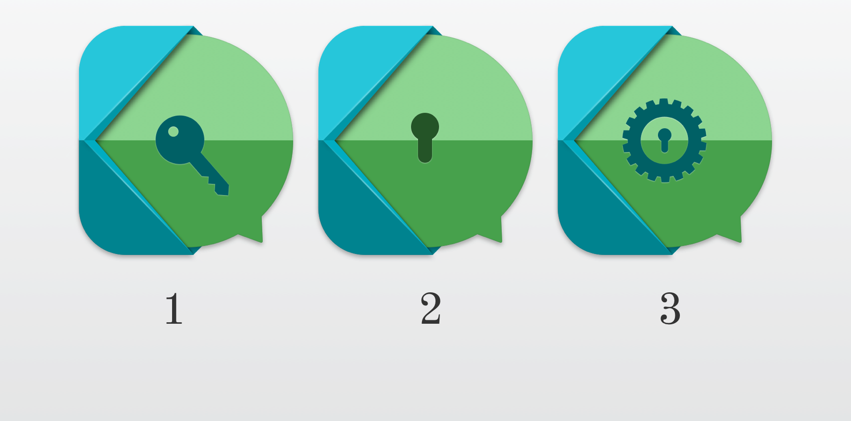
- 1° (key)
- 2° (key hole)
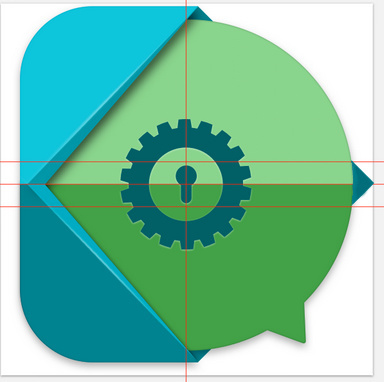
- 3° (key hole with gear)
0 voters
3 Likes
No to your Icons! They look like this:
„And Now for Something Completely Different“:*
think of a loudspeaker-symbol instead of Packman …?
(*Monty Python)
I’d like it best if the key and the gear were combined.
Maybe the best way to avoid this if there was something like
so you can see that this is supposed to be a mesage. Probably not what you thought of, @Iconprojet, but for me it seems to be the best solution for the missunderstooding.
I think you guys are overreacting a little bit (I’m talking to the ones shouting “NO! Pac-man is going to eat all of us!”  ). I believe the concept is very nice. Besides, the solution by @OffifialMITX doesn’t respect perspective lines. Anyhow, the arrow at the end seems a bit “off” if you look at the wider picture, if you know what I mean.
The more I look at it, the more I don’t see that much resemblance with Pac-Man. Especially if I see it side-by-side with @Spielmops example.
That’s not very kind! We all know how this looks like but we all know that @Iconprojet is giving his best and we all are trying to solve the problem.
@daniele_athome, i don’t really understand what you mean, I know that doesn’t look correct but if you take a ruler you’ll notice that the lines are correct.
I think that’s because the padding is missing now and there’s no shade in my part.
How’s this:

Working-with-Gimp-training 
1 Like
Oooooooook please let’s focus on @Iconprojet icon on this topic shall we?
May I remind you, that it was my proposal that started this discussion?
I believe @Stanzi started the topic, if I’m getting your point right.
Anyway, I appreciate your contributions, I really do, but we are talking about choosing among a few proposals by @Iconprojet which has been doing this job for quite a while now I believe.
Besides, a rotated K is no longer a K really…
I keep feeling this tension going through this thread with no apparent reason. To guarantee a positive outcome, please avoid direct confrontation, stick to the topic, think in a contributing spirit and provide your feedback in a polite and respectful way.
Lets concentrate our efforts in improving the proposal and choosing together the final icon!
I am happy to see @Iconprojet has already replaced the controversial picture. We should keep the forum safe for everyone to browse from any place (work, public library, school, home).
1 Like
I fully agree with you.
1 Like
My focus was not on Pacman. (I just used Pacman as a visualization)But the similar to Conversations is eating by the Kontalk K.
I think this is solved in a really great way by @Iconprojet. All three drafts very nice im my opinion
We or @daniele_athome have only to choose one of this
That’s it…
1 Like
So guys? the progress of the survey ?, has reached Cuorum?
let me know so that we can give the material to Andrea for filling, thanks to all
1 Like
The poll is over!
 Key hole WINS!!
Thanks to everyone who participated.
2 Likes