I have seen this, but still it looks so.
1 Like

3 Likes
I also like the new icon, but I also would definitly make no reference to another messenger (which it is in my point of view because of the 3 white dots), nor would I make it shiny but stick to a flat design (material design)!
I totally agree with @webratte, @OffifialMITX, @SylvieLorxu and @FranBran .
The old icon with flat design looks more professional. And the reference to Conversations (getting eaten) is a no-go and very unfair. In fact, I spend some time on compatibility with Conversations.
Sorry @Iconprojet, I appreciate your work on the new icon but it simply has it flaws.
@abika It’s not a reference to Conversation app! Conversation did not invent the balloon symbol…
If you see a reference is purely coincidental…
Apart from the fact that he and your opinion then my icon and simply a evolution of the previous! I do not see us no eaten, and K with a conversation bubble that comes out of it! that’s all.
Why not just invert the speech bubble at the y axis and make it a little smaller? Maybe also use the original color of that part and remove the 3 dots / replace them with domething better? Maybe even just 2 or 4. I think the people will understand what it is supposed to be.
*without anything in it.
Sorry, I didn’t want to say the reference was intentional. But three people in this thread found the similarity and I believe many others will, too. This is quite unfortunate.

1 Like
It is interesting how this is viewed as K eating the bubble, instead of a bubble icon coming out of the envelop, which I think is an innovative approach and reference to Kontak’s K and function.
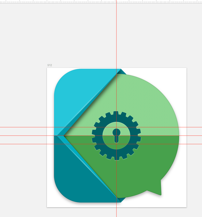
@Iconprojet would you consider removing the dots? Or perhaps replace them with a lock icon of some sorts? Or switching to another punctuation point? Perhaps that might make the icon less controversial. Please do not take the comments here as offensive, I am sure everyone is trying to offer their feedback to reach together the best possible outcome for the benefit of Kontalk!
Could you also provide new cover/header pictures I can use in social networks to accompany the new icon?
Fwiw, my gf finds the new icon a major improvement over the previous one 
4 Likes
Thanks very instructive comments that the lock can be a good idea, remember guys that over the inherent aspect to what an app should do, personally I look above all the aesthetic part of the result which is subjective 
1 Like
It actually looks really good! I would go for the 1st one, because I predict people will now think the 2nd one references the signal icon  :
:
https://lh5.ggpht.com/jKZCC5NR0uU01scYefDjUICueE59pEpamDz3J3LDAg3X-6DupmpsDysbFUc8WUFDgfk=w300
1 Like
In fact, among other things as design and very used, personally 1st is much more modern
It is interesting how this is viewed as K eating the bubble, instead of a bubble icon coming out of the envelop, which I think is an innovative approach and reference to Kontak’s K and function.
Maybe it’s related to the similar to Pacman.
My first thougth was it’s just ironic because this discusiuon. And @Iconprojet just kidding with a Pacman eating WhatsApp. Then I realised the WhatsApp Logo has a phone inside. And so (still thinking is a joke) I browse the playstore and see the similar to Conversations.
Thats my Story…
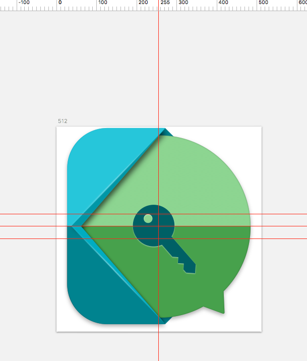
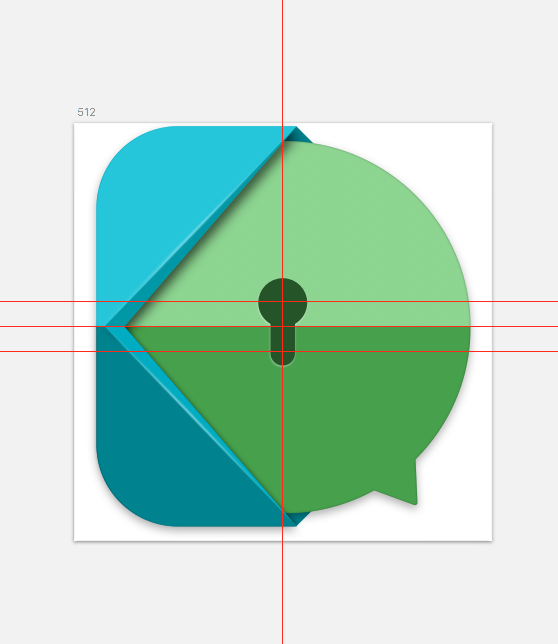
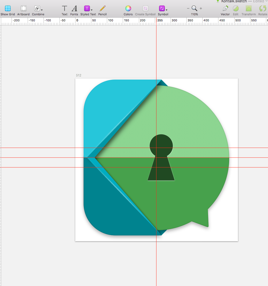
What about a padlock?  or a key?
  after all it’s all about keys isn’t it?
Also Kontalk is not closed like the Signal network, but open by design.
1 Like
Signal is blue. All will be good
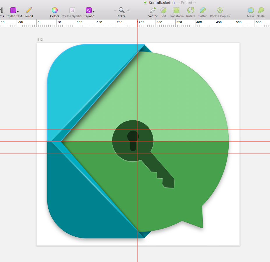
I like this icon very much! Thank you @Iconprojet! But I think the Key hole inside the key is a bit too much, honestly.