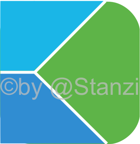
Continuing the discussion from here, i designed a prototype of a new Kontalk icon. I tried to make a compromise between the old and the new icon, in terms of the colours as well as the white lines, which are now a bit thinner than in the one icon. Unfortunately, I do not have photoshop, so I made this with OpenOffice Draw. I didn’t manage to get the left edges round, but I think it looks pretty ok-ish for a first prototype
Yes, I know Gimp. And I also know why I don’t like it. I has an interface about as easy to use as an airplane cockpit
But let’s keep the discussion about the logo
Gimp’s interface isn’t that complicated, if you’d just take half an hour, an input image and just tried every function you can find you’d learn very fast. Also, in my opinion, Photoshop’s interface is at least as complicated as Gimp’s one. I think an airplane cockpit is still way easier than one of a space shuttle.
P.S.: If you don’t need some functions you can just make them invisible in the settings.
Absolutely no reference to Conversations, it’s pure chance because the green balloon “being eaten” is actually the green part of the old icon, that’s all.


 Since we keep talking about the methods of logo making, your actual logo can’t be so bad!
  symbol is not very welcome in the open source community. Better go for a Creative Commons license:


