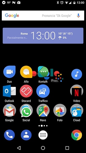
A very fine feature!
@Stanzi: if you get 3 Windows at Gimp-start, find the menu-entry: “one window” …
This is the ultimate icon I made hope you like it 
https://dribbble.com/shots/3149330-Kontalk-Icon
Very sarcastic 
Very nice! Thanks!
For me it looks like a Facebook pacman eats the Convesations app 
Too many Google apps on your phone! 
It looks good! My only thought is: Is it too shiny? All other apps are going towards flat design.
And it looks a bit smaller than the Allo-icon. As if it wouldn’t make use of all the available space.
@OffifialMITX Oh, it’s a reference to Conversations? I’d rather have it eat a walled-garden chat app (Whatsapp, Signal, etc.).
Same, it looks rather… weird to me.
OK, it seems not to be a joke.
I thougth it was only @Iconprojet 's ironic answer to the current discussion about the current Kontalk icon…
The idea was actually the message balloon coming out of the K… 
And no, it’s not a joke, it’s the actual proposal for the new icon.
Absolutely no reference to Conversations, it’s pure chance because the green balloon “being eaten” is actually the green part of the old icon, that’s all.
I have seen this, but still it looks so.
I also like the new icon, but I also would definitly make no reference to another messenger (which it is in my point of view because of the 3 white dots), nor would I make it shiny but stick to a flat design (material design)!
I totally agree with @webratte, @OffifialMITX, @SylvieLorxu and @FranBran .
The old icon with flat design looks more professional. And the reference to Conversations (getting eaten) is a no-go and very unfair. In fact, I spend some time on compatibility with Conversations.
Sorry @Iconprojet, I appreciate your work on the new icon but it simply has it flaws.
@abika It’s not a reference to Conversation app! Conversation did not invent the balloon symbol…
If you see a reference is purely coincidental…


